

Overview
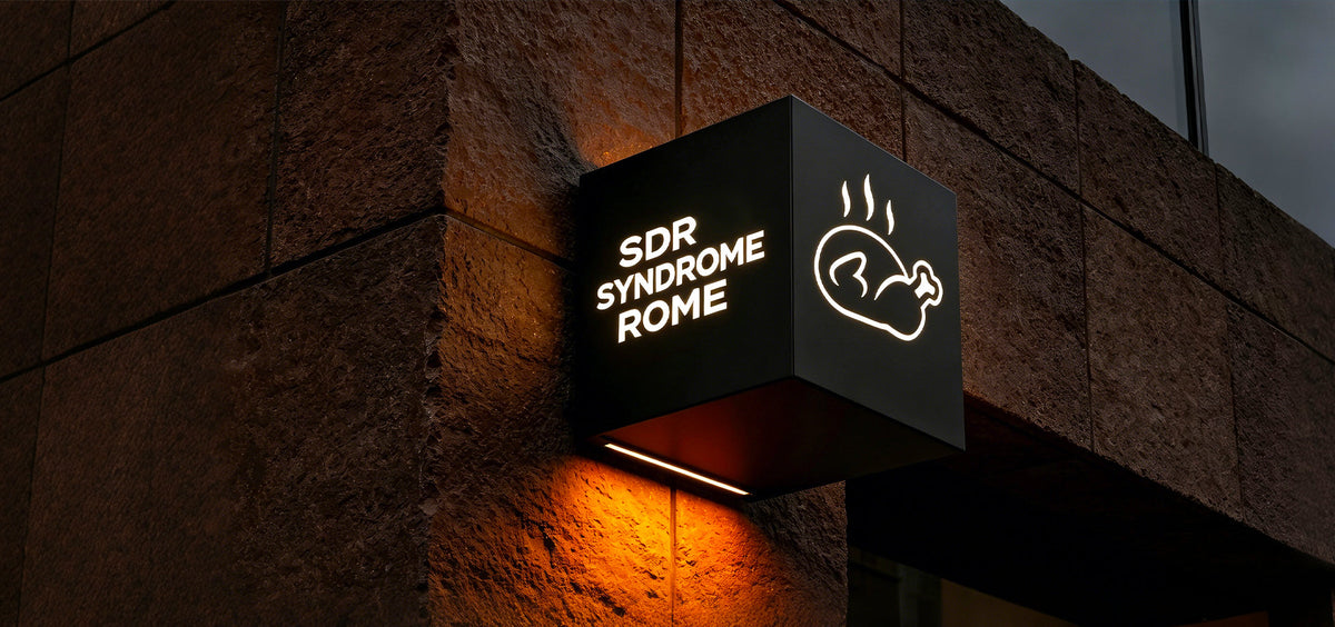
A completed interior decorative signage system designed for a fried chicken restaurant environment, using illuminated letters and lightbox elements to create clearer visual focus and a more refined in-store atmosphere while preserving the original brand identity. The signage integrates naturally into dining, ordering, and display areas, enhancing spatial perception through controlled lighting rather than visual overload.

Contact us to request a quotation for your signage project.
Context
The project involved an interior visual upgrade for a fried chicken restaurant. The existing illuminated signs were perceived as visually outdated and lacked impact. The updated signage needed to function as both brand expression and interior decoration, contributing to the customer experience while remaining consistent with the established brand language.
The scope included wall-mounted decorative signage, menu/promotional display areas, and customer-facing countertop zones. The environment required signage that could remain visually engaging over long operating hours, viewed from short distances, without appearing harsh or distracting in a food service setting.
Challenges
The project required introducing more visually striking signage while maintaining strict alignment with the existing brand system.
Key challenges included:
- Concept Translation: Translating creative ideas from a non-professional stakeholder into technically feasible signage solutions.
- Multi-Type Coordination: Managing multiple signage types within a single interior environment.
- Variable Control: Confirming each design across three critical variables: creative direction/product type, final dimensions/spatial proportion, and lighting color/visual output.
- Risk Mitigation: Reducing rework risk prior to scaling, as the client required high confidence before committing to batch production.
Process
Phase 1: Concept Translation & Feasibility Alignment
We supported the early creative stage by translating conceptual ideas into workable signage solutions. Different illumination principles and product structures were explained step-by-step to clarify visual outcomes. Selected designs were developed into 3D models, allowing for clearer visualization of form, depth, and lighting effects before moving forward.
Phase 2: Design Co-Creation & Option Structuring
As clarity increased, we provided structured creative options aligned with the brand tone. This helped organize decisions around visual impact and consistency. This phase focused on maintaining a cohesive visual system across different signage types (Backlit, Lightbox, and Mini Letters).
Phase 3: Physical Validation & Trust-Based Scaling
Unlike a standard fixed production flow, this project followed a "Validation First" strategy based on the client's preference for risk management. The client initially ordered a single unit of each signage type as a sample. These were tested in the actual restaurant environment to validate lighting performance and craftsmanship. Only after these physical samples proved their quality and visual effect did the client proceed to place the full batch production order.
Production & Installation
Preparation All units were produced according to the confirmed samples. Lighting components were pre-configured for interior use, and packaging included all necessary accessories to support efficient installation within the restaurant space.

Contact us to request a quotation for your signage project.
Outcome
- Refined Atmosphere: Interior signage updated to a more engaging and high-end system.
- Reliable Translation: Creative concepts successfully transformed into technically sound illuminated products.
- Confidence-Driven Scaling: Batch production initiated only after physical sample validation, ensuring 100% client satisfaction and zero rework.
- Brand Integration: Signage integrated smoothly into existing interiors while maintaining brand consistency.
Insight
This project reinforced the importance of structured guidance and trust-based validation. By allowing the client to verify quality through a "sample-first" approach, we bridged the gap between creative uncertainty and reliable execution, ensuring a smooth transition from a single idea to a multi-store rollout.

Specifications
Product Parameters
Backlit Letters × 70 Stainless steel housing, high-lumen LED
Lightboxes × 20 45.00cm×34.52cm, 4mm PC baseboard
Ultra-Thin Lightboxes × 110 20mm slim profile, color-calibrated LED panels
Precision Mini Letters × 40 25+5mm border, 10mm thick
Recommended reading
Dior Brand Store Luxury Fabricated Signage Design
Louis Vuitton’s Seasonal Pop-Up Display
Custom Signage Package for Arena Sports Bar & Lounge
5-Star Interior Refresh: Custom Lightboxes for LA’s Oldest Barbershop
Recommended products
LC-XFL02 · LED Frontlit Rimless Letters & Signs